Closer to Home has a new look!

Out with the old and in with the new!
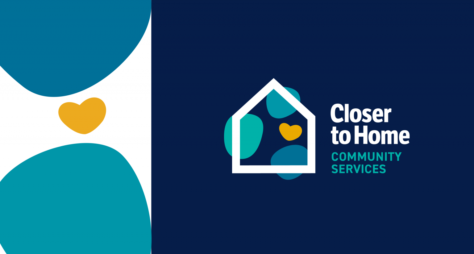
Closer to Home’s (CTH) branding has been reimagined with a refreshed colour palette and an energetic and contemporary look. The new logo was approved by our Board in June 2021 with a look that symbolically represents hope, healing and home, while emulating strength, stability and optimism. The elements in the logo are a balance of structured and organic shapes to represent unity, inclusivity, diversity, family and community. Together these elements reflect Closer to Home’s dedication to children and families for over 25 years.
Along with a new look and feel, we have refreshed our mission and vision statements to align with our new organizational goals.
Our Vision
Every child thriving within supportive family and community relationships.
Our Mission
Closer to Home Community Services facilitates growth and belonging in communities of meaningful relationships. Our integrity is grounded in evidence-based practice authentically informed by, and connected to, diverse cultural wisdom. We journey with children and families to uncover strength, hope and healing, creating new possibilities for a brighter future.
These two guiding statements will allow Closer to Home to continue supporting kids, families, and communities within Calgary and surrounding areas for years to come.
Look for our new branding on all platforms where you get CTH content!